Week 8: Customizing iPhone to beat Distractions
Lately, I’ve been drowning in phone notifications. Even worse, I caught myself opening apps for no reason—literally knowing there were no notifications waiting for me, yet still checking. That’s when I decided enough was enough.
Turning off notifications was an option, but I wanted something more intentional—a complete detox in how I interact with my iPhone.
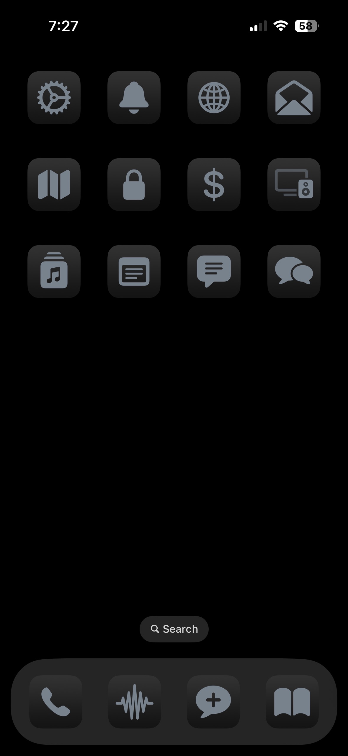
First off, I love the color black. So, I thought, what if I make all my app icons black/gray?
While looking into this, I stumbled upon Matt D’Avella’s latest video, which gave me a few more ideas.
My approach:
- Removed unnecessary apps from my home screen—out of sight, out of mind.
- Created shortcuts for frequently used apps, but without names—so I actually have to think before opening them.

And here’s the result: my home screen now looks extremely minimal, non-distracting, and, to be honest, kind of boring. But let’s be real—anything you want to sustain long-term is usually boring.
Impact
I spent way less time on my phone, barely opened apps, and finally felt in control of my time. A phone is supposed to be a tool—to communicate when you want to, not just because someone else demands your attention (unless it’s an emergency, which 99.9% of the time, it isn’t).